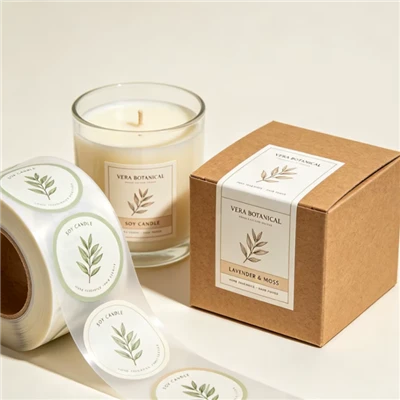
Choosing between clear BOPP labels and white BOPP labels can significantly affect how your product looks on the shelf. Both options use a polypropylene film material and can provide a clean, professional label surface, but they create very different visual effects. Clear labels allow the packaging or product itself to remain visible, while white labels provide a solid background that helps printed colors and text stand out.
For cosmetic brands, beverage manufacturers, and personal care companies, the decision is not simply about choosing a transparent or white material. The bottle color, product contents, label design, printing method, and retail environment all influence the final result. Understanding the differences between clear BOPP labels and white BOPP labels can help you select a label construction that supports both product presentation and everyday performance.
This guide compares their appearance, printing characteristics, applications, and customization options to help you decide which solution is right for your packaging.


What Are Clear BOPP Labels and White BOPP Labels?
BOPP stands for biaxially oriented polypropylene, a film material stretched in two directions during manufacturing. This process helps create a lightweight, dimensionally stable material commonly used for product labels. Depending on the construction, BOPP labels can offer good moisture resistance and a smooth surface for printing.
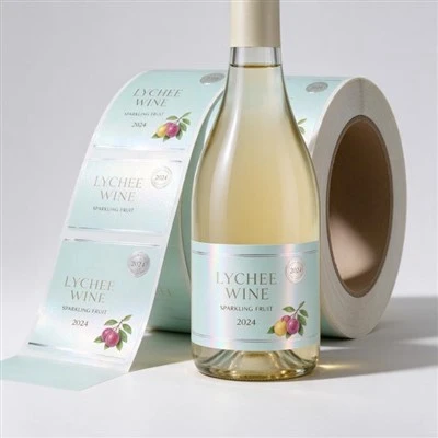
Clear BOPP labels use transparent film that allows the surface underneath to remain visible. When applied to a clear glass or plastic bottle, the label can create a minimal, nearly invisible appearance. This effect is often called a "no-label look," although the label itself is still present. The final appearance depends on the transparency of the film, adhesive clarity, printing coverage, and the container surface.
White BOPP labels use white film as the label base. The white background provides a defined printing area, helping text, logos, and colored graphics remain visible against different packaging colors. Brands can use this construction for bold product names, detailed ingredient information, colorful illustrations, or designs that need consistent visual contrast.
Although both options belong to the same general material family, their visual behavior is different. A transparent label integrates with the package, while a white label creates a more distinct boundary between the printed design and the container.
Neither option is automatically better. The right choice depends on what you want customers to notice first: the product inside the package, the printed design, or the overall brand identity.

Clear BOPP Labels vs White BOPP Labels: The Key Differences
The biggest difference between clear BOPP labels and white BOPP labels is the background behind the printed artwork. That background affects color appearance, text readability, and the way a label interacts with the product and container.
| Comparison | Clear BOPP Labels | White BOPP Labels |
|---|---|---|
| Appearance | Transparent, minimal, integrated with the package | Solid white background with a defined label area |
| Product visibility | Allows the container or contents to show through unprinted areas | Covers the area beneath the label |
| Color presentation | Can be affected by the color of the bottle or product | Provides a more consistent background for printed colors |
| White ink | Often needed for opaque text or selected graphics | Usually not needed to create a white background |
| Design style | Minimalist, premium, clean, understated | Bold, colorful, information-focused, versatile |
| Best suited to | Clear bottles, transparent packaging, selected cosmetic and beverage products | Colored containers, detailed graphics, product information, broad retail applications |
For example, a skincare brand using a transparent bottle may prefer a clear label to maintain a clean appearance. If the same design is printed on white film, the label will become a visible white panel on the bottle.
Conversely, a brand using a dark green, amber, or brightly colored container may find white film more effective because the background separates the artwork from the container color. This can make product names and important information easier to read.
The choice also affects how much of the container remains visible. If the package itself is part of the brand's visual identity, transparent film may be worth considering. If the printed label carries most of the visual message, white film may provide a more dependable starting point.
How White Ink Affects Clear BOPP Labels
One of the most important considerations when ordering clear BOPP labels is whether the design requires white ink.
Transparent film does not provide a white background for the printed artwork. If standard colored inks are printed directly onto a clear label, the container and product behind the label may influence how those colors appear. Graphics that look bright on a white design proof may appear darker, less saturated, or less distinct when printed on transparent film and applied to the actual package.
White ink can help solve this problem. It may be printed beneath selected colors to create an opaque base, or used in specific areas where white text, logos, or graphic details are required. The exact printing sequence depends on the artwork and production method.
Consider a cosmetic bottle with a pale pink liquid. A pink logo printed directly onto clear film may blend into the liquid and become difficult to see. Adding a white ink layer beneath the logo can improve its contrast. Alternatively, leaving some areas without white ink preserves transparency and creates a combination of opaque graphics and clear space.
This selective approach allows designers to balance product visibility with readable branding. However, white ink coverage increases the complexity of the artwork and should be considered during quotation and proof approval.
White ink is not always necessary. If the label uses dark graphics on a light-colored product, or if a deliberately subtle appearance is desired, printing directly onto transparent film may be sufficient. The best decision should be based on a physical proof applied to the actual container rather than the digital artwork alone.
For this reason, brands should confirm the white ink layer, color sequence, and intended transparent areas with their label supplier before approving production. You can also review 【Label Printing Processes】 to understand how different printing methods and finishing choices affect the final label design.


Which Label Is Better for Different Packaging Applications?
The best label depends on the container, product color, branding strategy, and amount of information that must be displayed. Evaluating the actual application is more useful than choosing a material based only on its appearance in a sample book.
Clear BOPP Labels for Transparent and Premium Packaging
Clear BOPP labels are often considered for transparent glass bottles, clear plastic containers, beverages, selected skincare products, and personal care packaging. Their main advantage is the ability to preserve the visual connection between the label and the container.
For a clear serum bottle, for example, a transparent label with restrained printing can make the packaging look clean and contemporary. A beverage brand may use the same approach to keep the liquid color visible while displaying the logo and product name.
Transparent film can also work well when the packaging shape, product color, or visible contents contribute to the overall presentation. It may suit minimalist designs that use a small logo, a limited color palette, and carefully positioned text.
However, transparency can create challenges. Bubbles, dust, uneven application, and visible adhesive patterns may be more noticeable than they would be under a conventional white label. The container surface and application process therefore deserve attention, particularly for large transparent panels.
White BOPP Labels for Bold Graphics and Readable Information
White BOPP labels are a strong option when the design requires a solid background, clear contrast, or extensive printed information. They can be suitable for shampoo bottles, lotion containers, food packaging, household products, and many other retail applications.
White film is particularly useful when the container is colored or when the brand needs its printed colors to remain visually consistent across different packaging formats. It can also make small text, ingredient panels, and detailed graphic elements easier to distinguish from the package beneath the label.
For example, a personal care brand selling the same formula in several bottle colors may choose white labels to maintain a consistent appearance. The white base separates the printed artwork from the container, helping the design remain recognizable across the product range.
White labels are not limited to simple designs. They can incorporate metallic effects, gloss or matte finishes, fine illustrations, and other printing features. The final look depends on the material, ink system, finishing method, and artwork.
A Practical Selection Guide
Before making a decision, ask these questions:
Is the product itself part of the visual design? If customers should see the liquid or container beneath the label, consider clear film.
Does the artwork rely on bright colors or white graphics? Clear film may require white ink in selected areas, while white film provides a built-in white background.
Is the container dark or strongly colored? White film may provide more predictable contrast.
Does the label contain a lot of text? Evaluate readability on the actual package, including curved areas and small print.
Will the package be exposed to moisture, oil, or frequent handling? Confirm the full label construction, including adhesive and surface finish, is suitable for the intended conditions.
If your decision also involves other film materials, see 【BOPP vs Vinyl Labels: Which Material Is Right for Your Product?】 for a comparison of material characteristics and applications.

Material, Adhesive, and Finishing: What Buyers Should Check
The appearance of a label is only one part of the purchasing decision. The film, adhesive, printing, and finishing need to work together under real application and storage conditions.
For both clear and white BOPP labels, the adhesive should be selected according to the container material and surface condition. Glass, rigid plastic, flexible plastic, and coated containers may require different adhesive constructions. A label designed for a flat glass bottle may not perform in the same way on a curved or squeezable plastic container.
Transparent labels require particular attention to the appearance of the adhesive layer. Even when the film itself is clear, the finished label may not look completely invisible if the adhesive creates haze or visible patterns on the surface. Application pressure, container cleanliness, surface energy, and label construction can all influence the result.
Brands should also consider finishing options. A gloss finish may enhance color and create a polished appearance, while a matte finish can support a softer visual style. Selective white ink, metallic details, and other effects may be incorporated where appropriate, provided they do not interfere with readability or the intended transparent areas.
If the package will encounter condensation, refrigeration, or frequent handling, test the label under representative conditions. A waterproof film does not automatically guarantee that the entire label construction will remain attached or look unchanged in every environment.
Before mass production, apply sample labels to the actual packaging and check initial adhesion, edge lifting, readability, and performance after exposure to the conditions the product will encounter. Our guide 【How to Test Label Adhesive Before Mass Production】 explains how to organize these checks without relying on an arbitrary fixed testing period.
For applications requiring moisture resistance, you can also review 【Waterproof Labels: Everything Brands Need to Know】 when comparing material and application requirements.

How to Order Custom Clear or White BOPP Labels
When requesting a quotation for custom labels, providing the right information helps the manufacturer recommend a suitable construction and prepare a more accurate sample.
Start with the packaging details: container material, shape, dimensions, color, and the intended label position. If the container is curved or tapered, provide a sample or clear photographs so the label size and layout can be evaluated correctly.
Next, share the artwork and explain the desired appearance. For clear labels, identify which areas should remain transparent and which need white ink beneath the graphics. For white labels, confirm the required background, color design, and any special finishing effects.
It is also helpful to specify the intended use environment. Relevant details may include moisture exposure, refrigeration, oils, storage conditions, and the way the product will be handled. These factors can affect material and adhesive recommendations.
Finally, request a sample or proof that represents the proposed production construction. Check the label on the actual container under normal lighting, not only on a computer screen. Confirm that the product name is readable, the colors look appropriate, and the label creates the intended visual effect.
At SpeedPrint, customers can discuss customized label sizes, materials, printing, and finishing options for different packaging requirements. The recommended construction should be based on the actual application rather than assuming that one BOPP label type suits every product.
FAQ: Clear BOPP Labels vs White BOPP Labels
1. Are clear BOPP labels waterproof?
BOPP film generally offers good moisture resistance, making it suitable for many applications exposed to water or humidity. However, the performance of the complete label also depends on the adhesive, printing, finish, container surface, and application conditions. The final construction should be tested for the intended environment.
2. Do clear BOPP labels always need white ink?
No. White ink is useful when the design needs opaque white details or stronger color contrast. If the artwork is intended to remain transparent or the background already provides sufficient contrast, direct printing onto clear film may be appropriate.
3. Are white BOPP labels easier to read than clear labels?
They can be, particularly when the design contains small text or uses colors that need a consistent background. White film provides a solid base, while clear film allows the container and product behind it to influence the appearance. Actual readability depends on the artwork, ink coverage, font size, and packaging color.
4. Which is better for cosmetic bottles: clear or white BOPP labels?
Clear film may suit transparent bottles and minimalist cosmetic designs, while white film may work better for colorful graphics or detailed product information. The best option depends on the brand identity, container color, product contents, and intended shelf appearance.
5. Can clear BOPP labels be used on colored bottles?
Yes, but the bottle color can change how printed colors appear. Brands should evaluate contrast and readability on the actual container. White ink beneath selected graphics can help preserve color visibility where needed.
6. Can clear and white BOPP labels use the same adhesive?
Sometimes, but this should not be assumed. Adhesive selection depends on the container surface, shape, application temperature, and use environment. The correct adhesive should be confirmed for the specific label construction and packaging.
7. Which option is more suitable for premium packaging?
Both can support premium packaging. Clear film can create a minimalist, integrated appearance, while white film can support bold graphics, refined typography, and complex printed designs. Material choice should reflect the brand's intended visual identity rather than price or appearance alone.
Conclusion
Choosing between clear BOPP labels and white BOPP labels comes down to the relationship between your artwork, container, and product presentation. Clear film is worth considering when transparency and product visibility are important. White film is often a practical choice when you need a consistent background, strong color contrast, and clear printed information.
Before ordering, evaluate the actual container, determine whether white ink is required, confirm adhesive compatibility, and test the finished label on the package. These steps help ensure the selected label looks right and performs as expected after production.
For brands developing new packaging or refreshing an existing product line, SpeedPrint can help explore custom BOPP label options based on your material, design, and application requirements. Contact the team to discuss your packaging and request a suitable label solution.
References
Avery Dennison Label and Packaging Materials
UPM Adhesive Materials
GS1 – Standards and Identification