Introduction
When designing product labels, choosing the right printing method can affect color accuracy, production costs, and the overall appearance of your packaging. Two common options are CMYK process printing and Pantone spot-color printing. Both are widely used in commercial printing, but they produce colors in different ways and serve different design needs.
The main difference between CMYK vs Pantone printing is how colors are created. CMYK combines four process inks-cyan, magenta, yellow, and black-to reproduce a broad range of colors. Pantone printing uses specifically formulated spot inks to match selected colors from a standardized color system.
Neither method is automatically better for every project. If your label contains photographs, gradients, and many colors, CMYK may be the practical choice. If your logo requires a specific brand color to remain consistent across packaging materials and repeat orders, Pantone spot colors may be more suitable.
This guide explains how the two methods compare and how to choose the right option for your product labels.

1. What Is CMYK Printing?
CMYK stands for cyan, magenta, yellow, and key (black). These four process inks are combined in different proportions to reproduce colors and images.
Instead of using a separate ink for every color in the artwork, CMYK creates many colors through combinations of its four inks. This makes it useful for designs containing multiple colors, photographs, illustrations, and gradients.
Advantages of CMYK Printing
Flexible color reproduction: Suitable for complex designs containing many colors.
Efficient for multicolor artwork: Four process inks can reproduce a wide range of colors without preparing a separate spot ink for every shade.
Suitable for product photography: Useful for labels featuring fruit images, cosmetic product photographs, and detailed illustrations.
Widely supported: Many commercial printing workflows are designed to handle CMYK artwork.
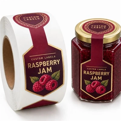
CMYK is often used for food packaging, beverage labels, cosmetics, promotional stickers, and other products that require colorful graphics.
For example, a snack label featuring several ingredients, colorful illustrations, and a gradient background may be efficiently produced using CMYK. For projects requiring multiple designs, [custom printed product labels] can be specified according to the artwork, material, and printing process.
Limitations of CMYK Printing
CMYK cannot reproduce every visible color. Some highly saturated, fluorescent, or distinctive brand colors may fall outside its reproducible range.
Color results can also vary with the printing process, substrate, ink system, and finishing treatment. A color displayed on a monitor may therefore look different when printed.
If exact color appearance is important, ask your printing supplier about color profiles, proofing, and whether a spot color would be more appropriate.

2. What Is Pantone Spot-Color Printing?
Pantone is a standardized color-matching system used to specify colors across design and printing workflows. In spot-color printing, a particular ink is prepared to match a selected color specification rather than creating that color solely by combining CMYK process inks.
This approach can be particularly useful when a brand relies on a recognizable logo color or a specific solid color across its packaging.
Advantages of Pantone Printing
Targeted color matching: Helps reproduce specified spot colors when the ink, material, and printing conditions are properly controlled.
Brand consistency: Useful for maintaining recognizable colors across repeat orders.
Solid-color coverage: Can provide effective results for designs built around specific solid colors.
Special ink possibilities: Depending on the printing system, spot inks can include certain metallic or fluorescent effects unavailable through standard CMYK alone.
Pantone spot colors are often considered for premium packaging, branded cosmetic products, and labels where a particular logo color is a major part of the brand identity.
For instance, a skincare brand may need its signature green or purple to remain visually consistent across multiple product labels. A Pantone spot ink can help achieve the target color when the selected printing process supports it.
Limitations of Pantone Printing
Pantone printing may require additional ink preparation, setup, or printing units. If a design contains many different spot colors, production can become more complicated and expensive.
It is also important to understand that a Pantone reference does not guarantee identical visual results on every substrate. Coated paper, uncoated paper, white film, and transparent film can display the same specified ink differently.
Pantone is a color specification system, not a guarantee that all materials and printing methods will produce an identical appearance.

3. CMYK vs Pantone Printing: Key Differences
The following comparison can help you identify which method better suits your project.
| Factor | CMYK printing | Pantone spot-color printing |
|---|---|---|
| Color creation | Combines four process inks | Uses a specifically formulated spot ink |
| Complex images | Well suited to photographs, gradients, and multicolor artwork | Less convenient when many different colors are required |
| Specific brand colors | May struggle with colors outside the CMYK gamut | Useful for matching selected standardized spot colors |
| Solid-color designs | Can work well, depending on the design and equipment | Often suitable for designs centered on specific solid colors |
| Production setup | Uses a four-color process | May require additional spot-color setup |
| Cost considerations | Often practical for complex multicolor designs | May be economical for some limited-color designs, depending on setup |
| Metallic or fluorescent effects | Standard CMYK cannot create true metallic reflectivity or fluorescent ink effects | Specialized spot inks may provide these effects when supported |
| Best suited for | Detailed, multicolor artwork | Selected brand colors and specific solid-color requirements |
The actual cost depends on order quantity, printing equipment, the number of colors, setup requirements, and finishing. It is best to compare production quotes based on the same artwork and specifications rather than assuming one method is always cheaper.
4. Which Printing Method Is Better for Different Products?
The right choice depends on the design and the packaging requirements. Here are some common examples.
Food and Beverage Labels
Food labels frequently include product names, ingredient illustrations, nutrition information, and colorful graphics. CMYK is a practical choice for designs containing multiple colors and detailed images.
Pantone may be worth considering when a food brand has a distinctive logo color that needs closer control across repeat orders.
For packaging exposed to condensation or moisture, color selection is only one part of the decision. The label material, adhesive, and protective finish also need to suit the environment. Consider [custom food packaging labels] designed around your product's packaging surface and storage conditions.
Cosmetic and Personal-Care Labels
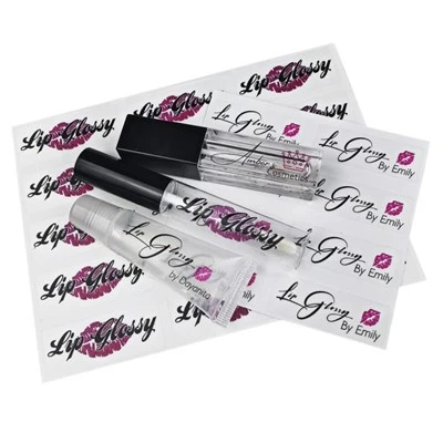
Cosmetic packaging often relies on carefully selected colors to communicate product positioning. CMYK works well for detailed artwork, gradients, and photographic graphics, while Pantone can be useful for specific brand colors.
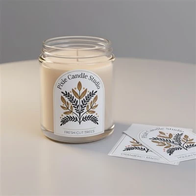
A premium skincare label may combine CMYK for its detailed design with a spot color for a key brand element. Depending on the project, additional finishing such as foil stamping or embossing may create a more distinctive appearance.
For packaging where brand colors and surface effects are important, [custom cosmetic labels] can be planned around the desired color specifications, label material, and finish.
Premium and Luxury Product Labels
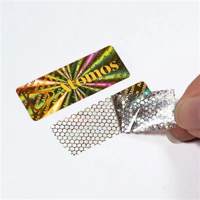
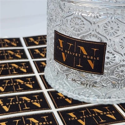
Premium packaging may require special colors, subtle visual contrasts, or metallic effects. Pantone spot colors can help with selected solid-color requirements, while metallic inks or foil stamping may be used when the design calls for a reflective finish.
However, metallic foil is not the same as a Pantone spot color. Foil stamping generally uses a separate finishing process, and standard CMYK printing cannot reproduce the reflective effect of real metallic foil.
For designs featuring metallic details, [custom metallic foil labels] may be an option worth discussing with your supplier.
Promotional Stickers and Product Variations
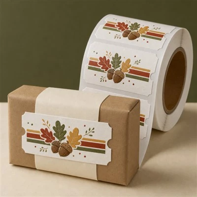
Promotional stickers and labels for multiple product variations often include complex illustrations, changing colors, or different artwork for each SKU. CMYK can be suitable for these designs because it reproduces a broad range of colors through a four-color process.
Digital printing may also be worth considering for short runs or frequently changing artwork, depending on the equipment and production requirements.

5. Can CMYK and Pantone Be Used Together?
Yes. Some label projects combine CMYK process printing with one or more Pantone spot colors.
This approach can be useful when most of the design contains photographs or multicolor graphics, but a specific logo or brand element needs a dedicated spot ink.
For example, a beverage label might use CMYK for fruit illustrations and background gradients, while a Pantone spot color is used for a distinctive brand name.
Combining the two methods can provide more control over selected colors, but it may also increase production complexity, setup requirements, and cost. It is most useful when the additional color control provides a meaningful benefit.
Before selecting a combined process, ask your supplier to confirm that the printing equipment supports the required setup and that the artwork is prepared correctly.
6. How to Choose the Right Method for Your Labels
Before making a decision, consider these five factors.
1. Identify the Most Important Colors
If your artwork contains many photographs, gradients, and illustrations, start by considering CMYK. If a specific logo color is essential to your brand identity, discuss Pantone spot-color printing.
2. Consider the Label Material
The same ink can look different on coated paper, uncoated paper, white BOPP, and transparent film. Surface texture, whiteness, opacity, and finishing can all affect perceived color.
For an overview of how different paper surfaces affect printed results, read [Printing Paper Types: Best Materials for Different Applications].
3. Define Your Color Consistency Requirements
If you reorder the same label regularly, establish an agreed color reference and proofing process. Pantone specifications can help communicate a target spot color, while process-color jobs may use defined CMYK values and suitable color profiles.
4. Compare Production Costs
Ask your supplier to compare the methods using the same design, quantity, material, and finish. A multicolor CMYK design may be more straightforward to produce than a design requiring many separate spot inks, but the result depends on the production setup.
5. Approve a Suitable Proof
A screen preview is not enough to judge every print color accurately. When color is important, request an appropriate proof and confirm the intended substrate and finish.
For more information on preparing artwork and understanding four-color printing, see [Why CMYK Printing Is Used for Labels and Packaging].
FAQ
Is Pantone more accurate than CMYK?
Pantone spot colors can provide more controlled reproduction of specified colors when the correct ink and printing conditions are used. CMYK is flexible for complex artwork, but it cannot reproduce every color. Neither method guarantees identical appearance across all materials.
Is CMYK cheaper than Pantone printing?
Not always. CMYK can be practical for complex multicolor designs, while Pantone may be competitive for certain limited-color jobs. Setup, quantity, equipment, and finishing determine the final cost.
Can CMYK reproduce my exact brand color?
It depends on the color. Many brand colors can be reproduced satisfactorily in CMYK, but some highly saturated or unusual colors may fall outside the CMYK gamut. Ask your supplier to check the color and recommend a suitable proof or spot-color alternative.
Can Pantone colors be used on transparent labels?
Yes, if the selected printing process supports the required spot ink. However, transparent materials may need an opaque white ink layer beneath certain colors to improve visibility. The final result depends on the design and substrate.
Which method is best for cosmetic labels?
CMYK is suitable for detailed artwork and gradients. Pantone may be preferable when specific brand colors are critical. Some projects combine both methods or add specialty finishing for a particular visual effect.
Do I need Pantone printing for every product label?
No. Many labels can be produced successfully using CMYK alone. Consider Pantone when precise matching of selected brand colors is important enough to justify the additional setup or production requirements.
Conclusion
When comparing CMYK vs Pantone printing, the best choice depends on the artwork, brand-color requirements, label material, production quantity, and budget.
CMYK is often a practical choice for colorful graphics, photographs, gradients, and designs containing many colors. Pantone spot-color printing is useful when a specific solid color needs controlled reproduction. For some packaging projects, combining both approaches can offer a balance between design flexibility and color consistency.
Before placing an order, confirm the material, printing process, color specifications, and finish with your supplier. A suitable proof and a clear color reference can help reduce surprises and improve consistency across repeat orders.